Echoed Paths —
designing trust for a
mental wellness brand
A holistic mental health practice needed a logo and website from zero. The real brief: make it feel safe enough that someone in pain would actually reach out.
Defined the emotional register first: warm but grounded, hopeful but not saccharine. Competitors skewed clinical or over-illustrated — the gap was editorial warmth with structural clarity.
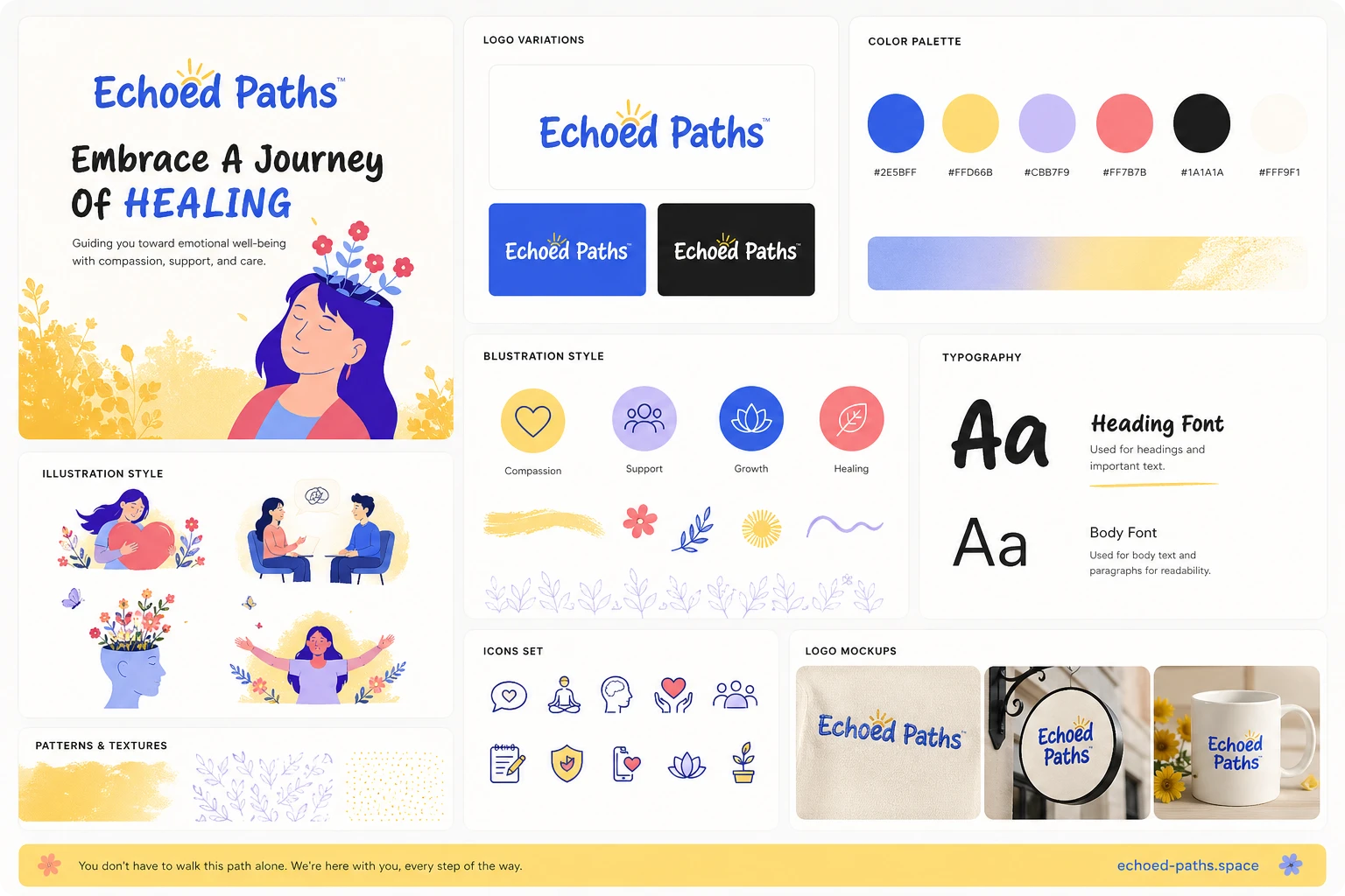
The name suggests continuity and reflection. The mark uses an organic looping form — soft, not sharp — evoking both a path and an echo wave. Paired with a clean wordmark for professional grounding.
Warm ivory backgrounds, muted sage greens, golden accents. No clinical white. Illustration over photography — illustrations feel metaphorical and safe.
Hero → Why Us → Services → Proof → CTA. No dead ends. Single CTA throughout. Nav is minimal — no dropdowns, no complexity.
WordPress + Elementor for easy client-managed content. Mobile-first — mental health users often browse on phone, privately.


